Implementing Funnel Best Practices
Creating funnels within the Funnel Builder works best through simplicity. The simpler the funnel is set up the easier it will be to convey your message, convert leads into sales, and perform regular maintenance and changes. Here are some best funnel practices that will help you get started.
Overall Funnel Settings
SEO Meta Data is the key to your funnel being found! Be sure to name your funnel’s SEO Title appropriately to match your funnel and add a description. Keywords can be added to your SEO Meta Data to capture key words used during web searches.

To make sure all fonts chosen are consistent throughout the funnel, use the Typography tab under the Overall Funnel Settings to choose the native Headline and Content fonts that will be used throughout the funnel.

Sections
If padding and margins are being used within the section, be sure to use consistent spacing so the section is visually balanced.
Depending on the margins desired for the funnel, decide whether you would like full width for the sections or not. This setting helps have preset margins that are consistent throughout the entire funnel.

Rows
In some cases, there needs to be a certain amount of space in the row to accomplish your design idea. It is best to adjust the row width to increase or reduce the space of the row. This allows for the responsiveness of the row to be consistent on different screen sizes.
The row alignment can also be modified so that the row can be centered aligned, right aligned, or left aligned. This is the best option instead of using padding to move around content within the row.

Columns
The most useful settings for columns are the Column Layout Settings.
The Content Alignment of the column can be modified so that all the elements in the column stack up vertically or align horizontally.
The Content Spacing setting changes where the elements are positioned in the column (at the top, bottom, or center of the column).

Elements
The most used elements in a funnel are the copy-related elements. It is very important to make sure that the correct Font Type is chosen for each copy/text element (headline, subhead line, paragraph).
Depending on the section design and layout, different text/copy alignments are needed. Be sure to use consistent text/copy alignments throughout each section so that the composition does not feel unbalanced and translates properly to the user.
To establish a visual hierarchy, make sure the appropriate font size is chosen for all headlines, subheadlines, and paragraph copy (for both desktop and mobile view). If incorrect font sizes are used, it can make the text/copy unreadable and/or translate differently than what was intended.

Detailed Border Customization
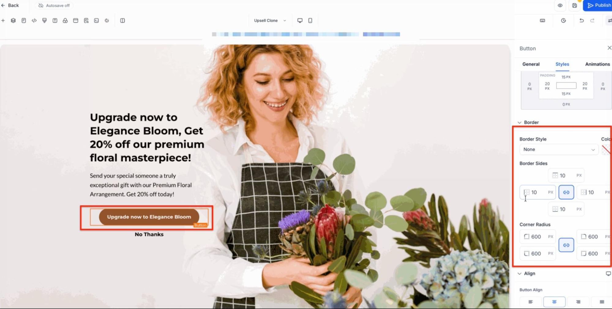
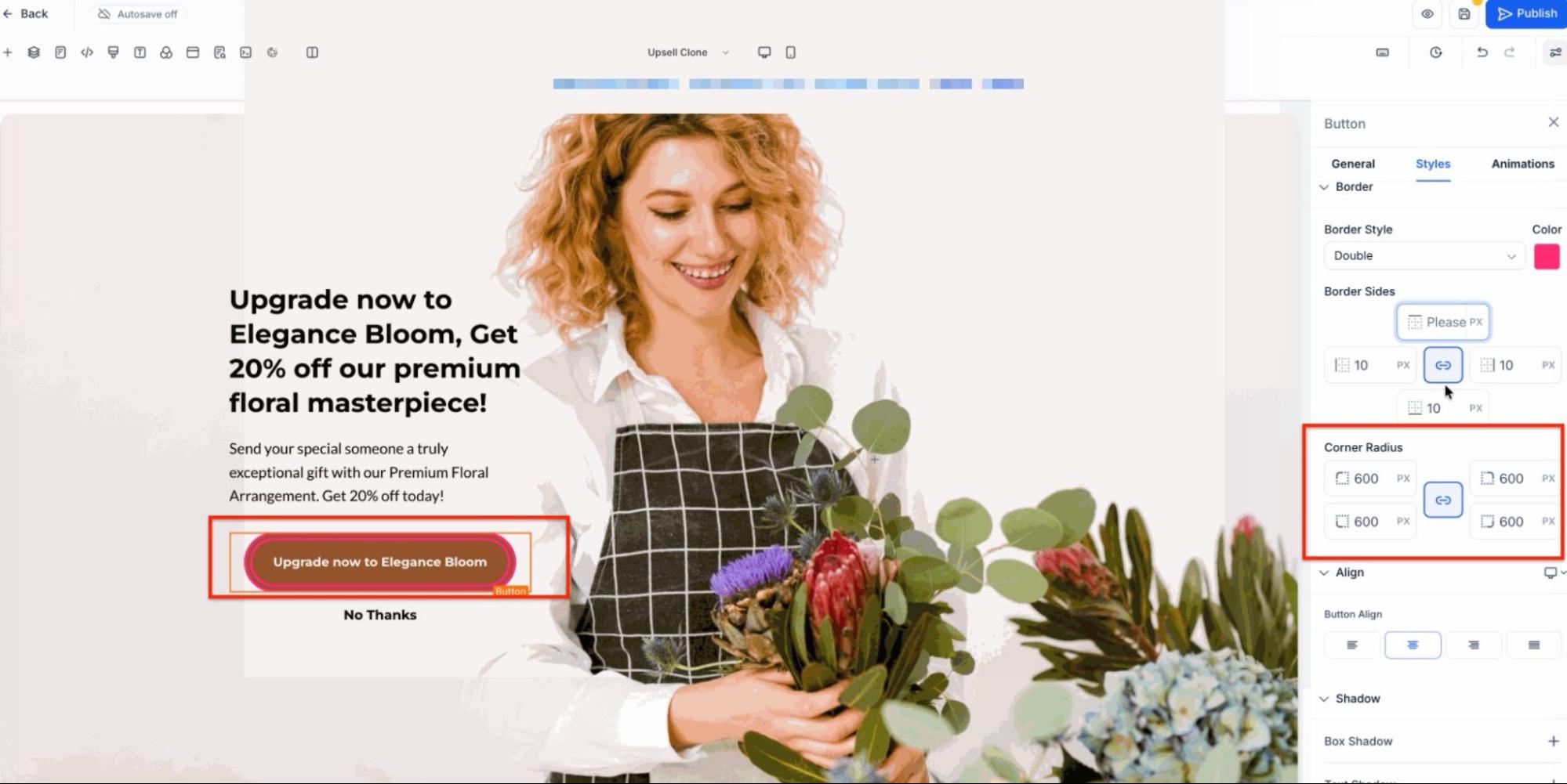
For elements that support borders, Mastermind provides a unified border settings panel to ensure a professional and uniform appearance across your pages. Users can access these options by selecting a compatible element and navigating to the Border section within the ‘Style’ settings.
- Individual Side Control: You have the ability to define the border width for each side of an element independently rather than applying a single width to all sides.

- Corner Radius Customization: To create unique shapes or softer edges, you can adjust the border radius for each corner individually.

- Diverse Styling Options: Beyond standard lines, there are several border styles available to enhance your design, including double, groove, ridge, inset, and outset.
- Legacy Compatibility: Design configurations remain stable, as pages created with previous border settings continue to function correctly while benefiting from the updated interface.
FAQ
Question: What are the overall funnel settings I should focus on?
Answer: Focus on setting up your SEO Meta Data by adding an appropriate SEO Title, description, and keywords that match your funnel. Additionally, use the Typography tab under Overall Funnel Settings to ensure consistent fonts throughout the funnel.
Question: How can I maintain visual consistency in funnel sections?
Answer: Use consistent padding and margins within each section. Decide whether to use full-width sections or set margins that stay consistent throughout the funnel.
Question: How do I adjust rows for better design and responsiveness?
Answer: Adjust the row width to increase or decrease space and ensure responsiveness across different screen sizes. Use row alignment settings (center, left, or right) instead of padding to align content.
Question: What settings should I focus on for columns?
Answer: Utilize the Column Layout Settings, focusing on Content Alignment (vertical or horizontal stacking) and Content Spacing (top, bottom, or center alignment) to position elements within columns effectively.
Question: What is important when setting up text elements in a funnel?
Answer: Ensure you choose the correct Font Type for each text element (headline, subheadline, paragraph) and maintain consistent text alignments throughout each section. Also, establish a visual hierarchy by selecting the appropriate font sizes for desktop and mobile views.
Question: What is the "Social Image" in the SEO settings used for?
Answer: This is the preview image that appears when you share your funnel link on platforms like Facebook, LinkedIn, or via SMS. Without a custom Social Image, platforms will either show a blank box or a random image from your page, which looks less professional.
Question: What is the primary rule for creating funnels in the Funnel Builder?
Answer: The primary rule is simplicity. Keeping a funnel setup simple makes it easier to convey your message, convert leads into sales, and perform regular maintenance or changes.
